
Launching an In-House Loan Case Verification Journey
Launching an In-House Loan Case Verification Journey
Launching an In-House Loan Case Verification Journey
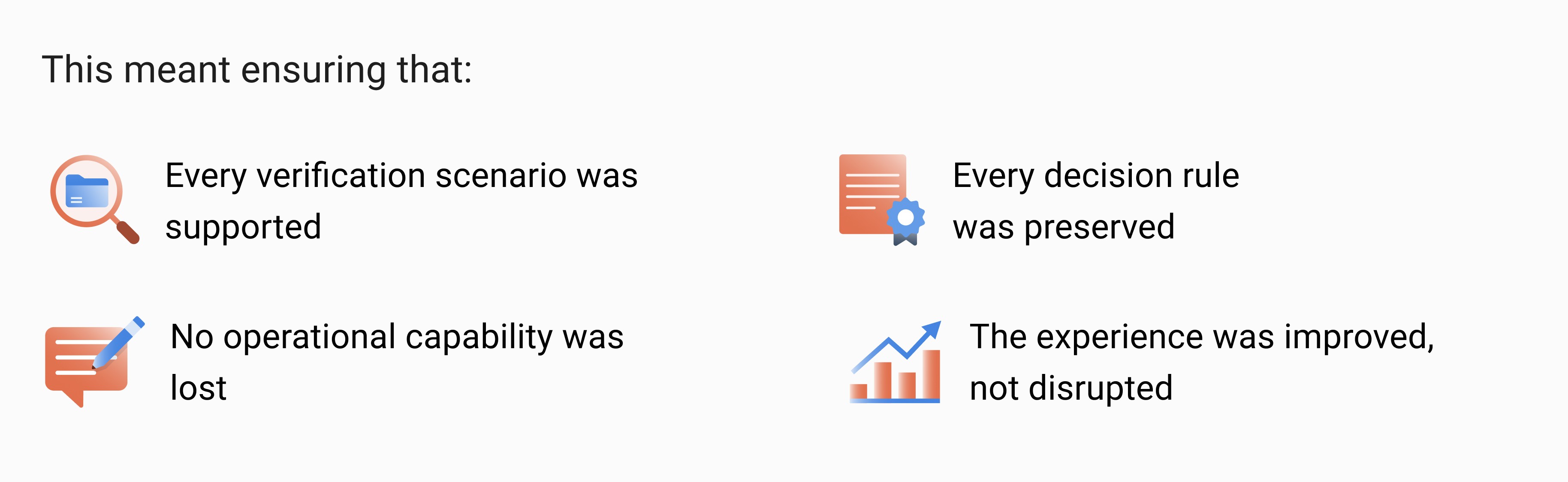
Bring 100% all products verification capabilities into the in-house platform
Bring 100% all products verification capabilities into the in-house platform
Problem Discovery
Problem Discovery
Problem Discovery
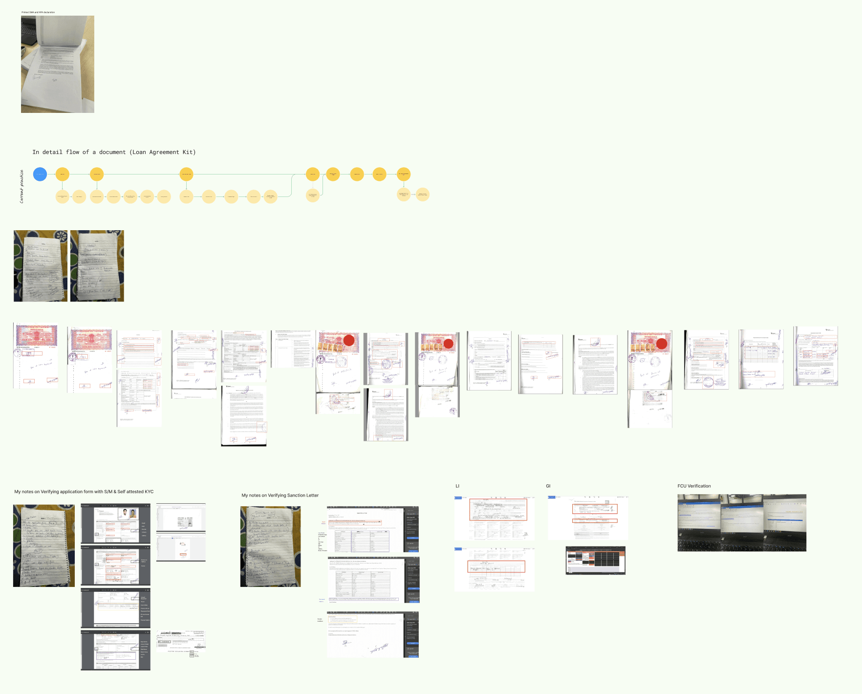
As loan volumes increased and more products were added, managing verification through third-party tools became difficult. Business and operations teams needed a fully controlled and scalable in-house verification system that could adapt to changing product rules and compliance requirements. Without this, the organization remained dependent on external systems, limiting flexibility, slowing improvements, and increasing costs. This also made it harder to improve user efficiency and scale operations alongside business growth
As loan volumes increased and more products were added, managing verification through third-party tools became difficult. Business and operations teams needed a fully controlled and scalable in-house verification system that could adapt to changing product rules and compliance requirements. Without this, the organization remained dependent on external systems, limiting flexibility, slowing improvements, and increasing costs. This also made it harder to improve user efficiency and scale operations alongside business growth

Current State
Current State
Current State
The loan case verification process was heavily dependent on third-party tools and manual workflows. While revenue and loan volumes were growing, the verification infrastructure remained rigid, externally controlled, and operationally fragmented.
Verification required multiple actors (Maker → Checker → Central Approver), but there was limited system intelligence, minimal tracking transparency, and high manual effort across the workflow.
The system functioned more as a data repository rather than an intelligent decision-support platform..
Research & Discovery
Research & Discovery
Research & Discovery
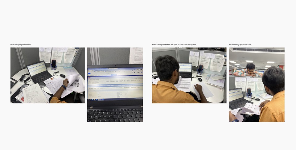
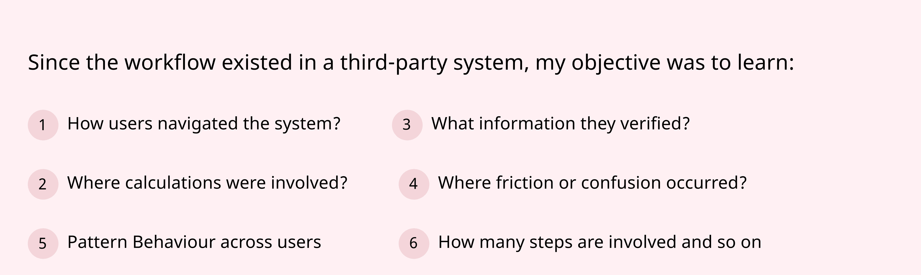
Before designing any solutions, I conducted on-ground research to understand how the verification process was currently being handled.
Before designing any solutions, I conducted on-ground research to understand how the verification process was currently being handled.
My goal was not to study the UI, but to understand the underlying logic, user behaviour, decision steps and product variations.
My goal was not to study the UI, but to understand the underlying logic, user behaviour, decision steps and product variations.

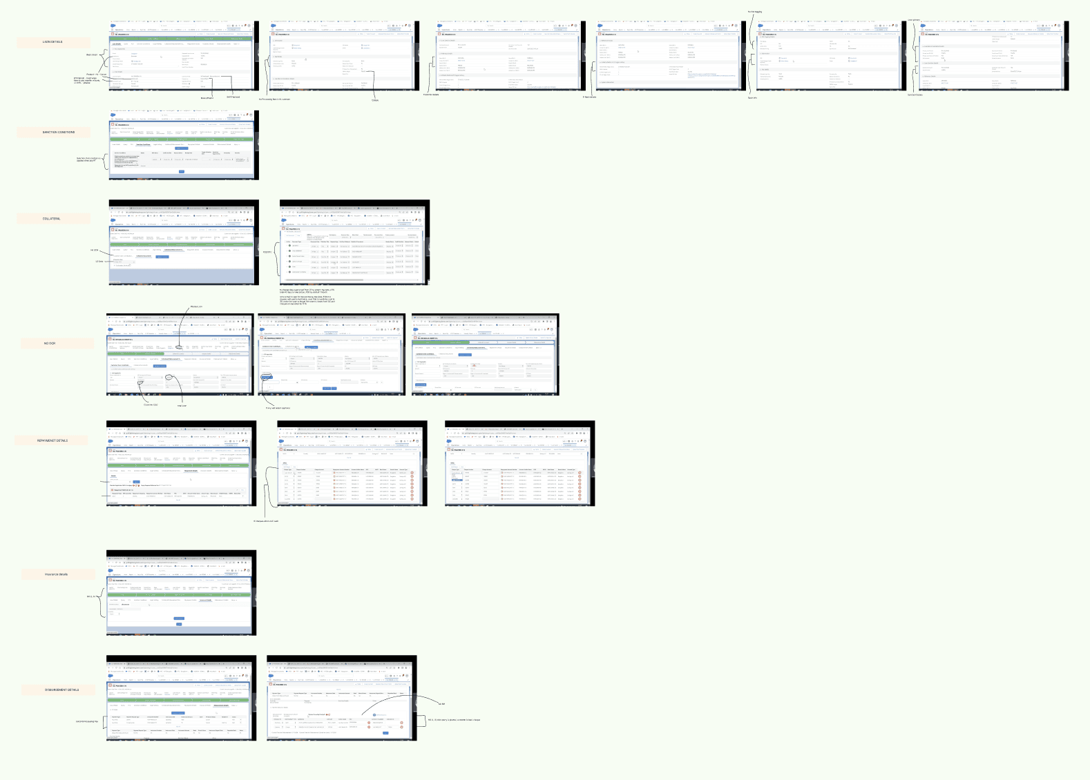
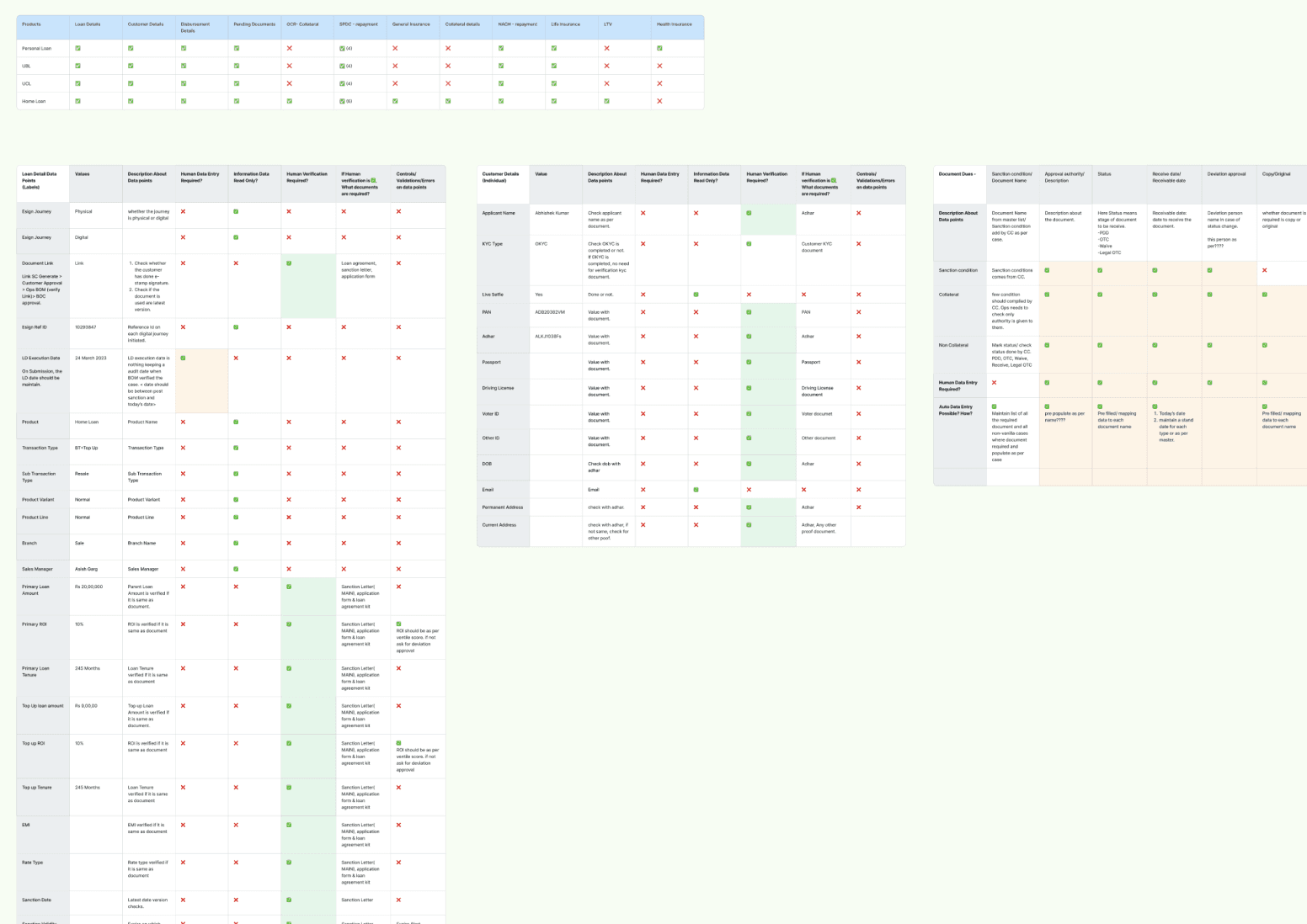
Documented End-to-End Verification Steps
Documented End-to-End Verification Steps
Mapped Verification Fields to Supporting Documents
Mapped Verification Fields to Supporting Documents
Documented Field-Level Validation Logic
Documented Field-Level Validation Logic
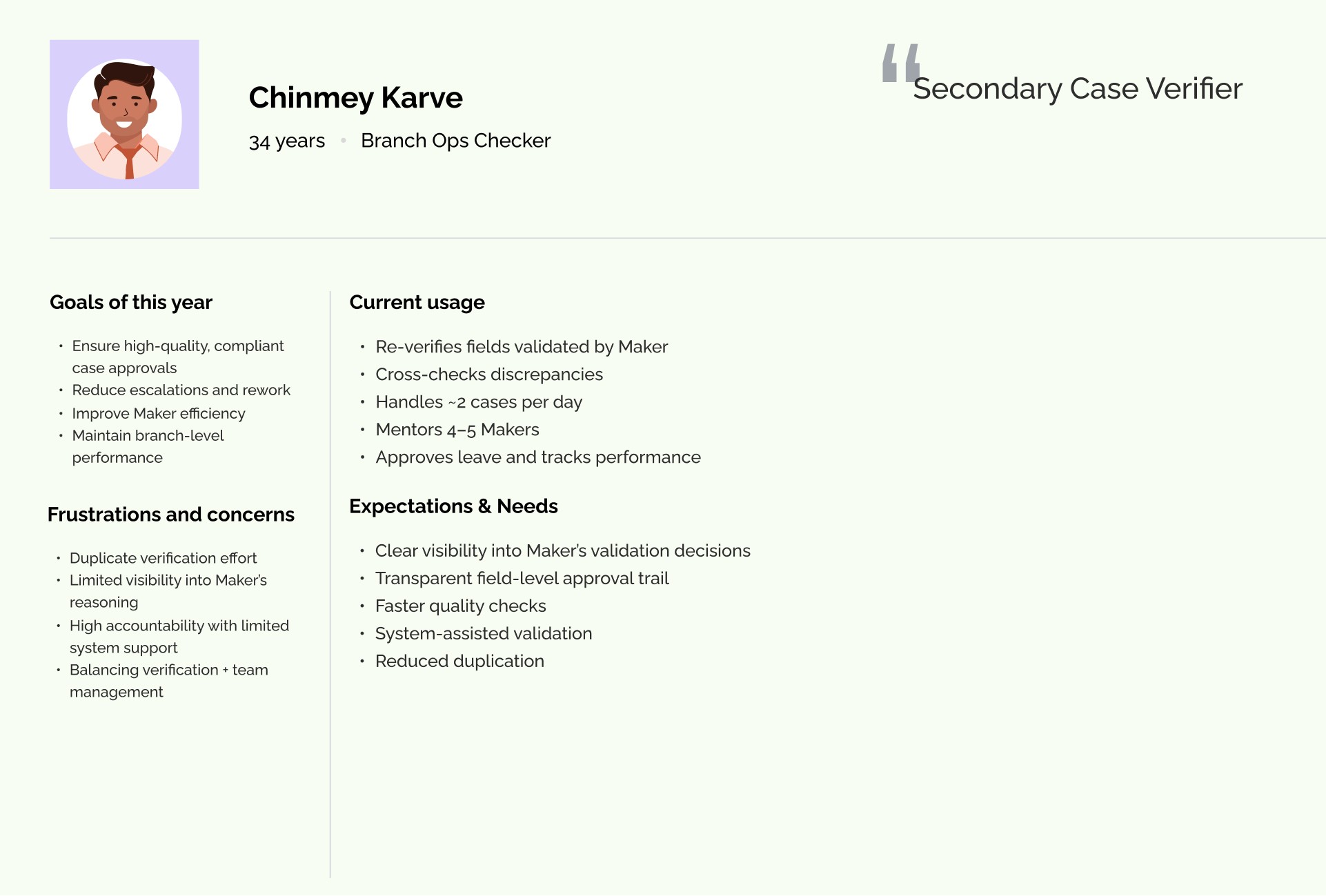
User Interviews
User Interviews
User Interviews
I also connected with end users to understand their pain points, daily challenges, and expectations from the system. These conversations helped identify workflow gaps and areas where the system was not effectively supporting them.
I also connected with end users to understand their pain points, daily challenges, and expectations from the system. These conversations helped identify workflow gaps and areas where the system was not effectively supporting them.
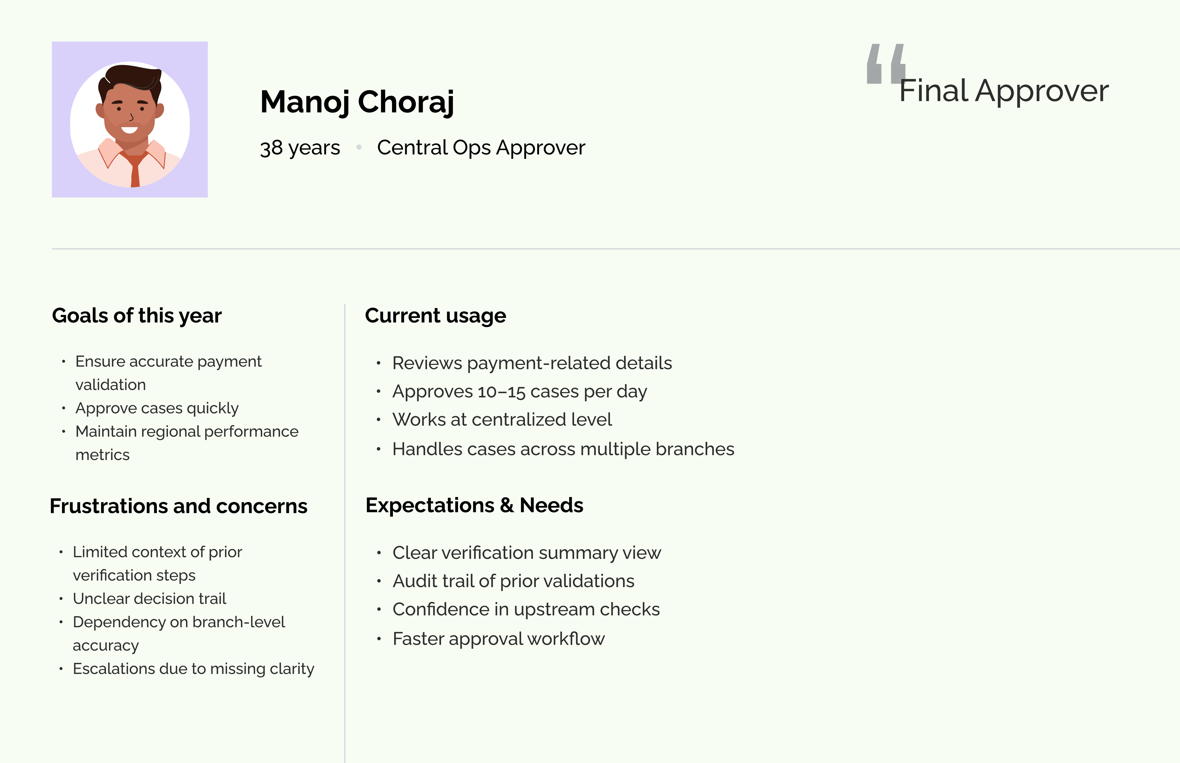
Pain Points/ Challenges
Pain Points/ Challenges
Pain Points/ Challenges
From on-ground research and user persona analysis, I identified the following user challenges.
From on-ground research and user persona analysis, I identified the following user challenges.
Too Much Information on One Screen
Too Much Information on One Screen
Users were shown large amounts of data without clear structure. There was no clear difference between fields that required action and those that were only for reference. This made it harder for users to quickly understand what needed to be verified.
Users were shown large amounts of data without clear structure. There was no clear difference between fields that required action and those that were only for reference. This made it harder for users to quickly understand what needed to be verified.
Constant Switching Between System and Documents
Constant Switching Between System and Documents
Supporting documents were not available directly inside the workflow. Users had to download files and open them separately to compare information. This back-and-forth slowed down the process and broke their focus.
Supporting documents were not available directly inside the workflow. Users had to download files and open them separately to compare information. This back-and-forth slowed down the process and broke their focus.
Manual and Repetitive Calculations
Manual and Repetitive Calculations
Users had to manually calculate EMI and other financial values to verify details. They also re-entered data in multiple places. These repeated tasks took extra time and increased the chances of mistakes.
Users had to manually calculate EMI and other financial values to verify details. They also re-entered data in multiple places. These repeated tasks took extra time and increased the chances of mistakes.
No Clear Visibility of Case Status
No Clear Visibility of Case Status
After completing their part, users could not easily see what happened to the case. They didn’t know if it was approved, returned, or stuck with someone else. This led to frequent follow-ups and confusion.
After completing their part, users could not easily see what happened to the case. They didn’t know if it was approved, returned, or stuck with someone else. This led to frequent follow-ups and confusion.
No Clear Task Priority
No Clear Task Priority
Users were not guided on what to work on first. The queue did not clearly highlight urgent or important cases. As a result, users spent time deciding which case to pick next.
Users were not guided on what to work on first. The queue did not clearly highlight urgent or important cases. As a result, users spent time deciding which case to pick next.
Rechecking and Manual Tracking
Rechecking and Manual Tracking
Because there were no clear indicators of what had already been verified, users often rechecked the same fields. Some also kept notes outside the system to track progress.
Because there were no clear indicators of what had already been verified, users often rechecked the same fields. Some also kept notes outside the system to track progress.
System Did Not Adapt to Roles
System Did Not Adapt to Roles
The interface looked similar for all users, even though their responsibilities were different. This meant users saw information that was not always relevant to them, making the experience less focused.
The interface looked similar for all users, even though their responsibilities were different. This meant users saw information that was not always relevant to them, making the experience less focused.

Group Brainstorming Session
Group Brainstorming Session
Group Brainstorming Session
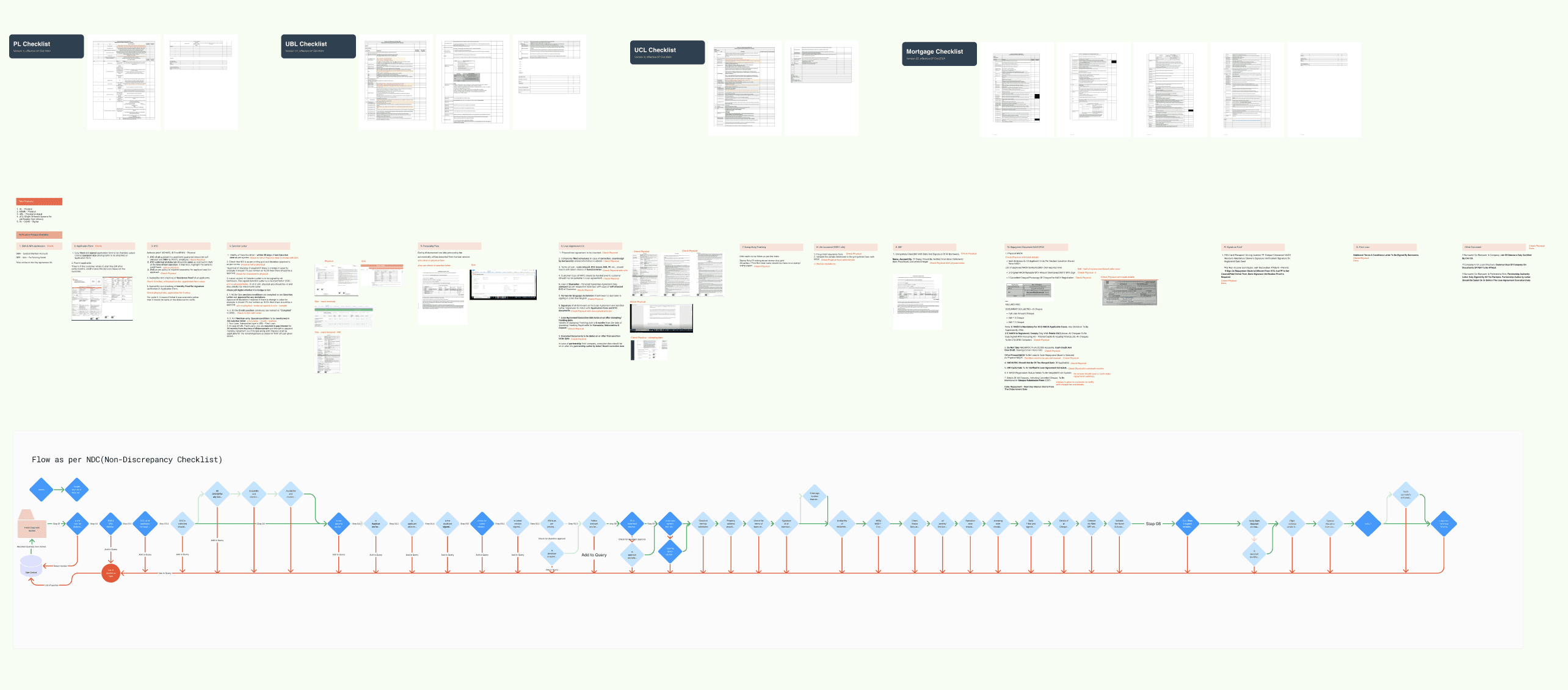
To simplify the verification process, we conducted workshop to detailed out field-level breakdown of the entire system.
To simplify the verification process, we conducted workshop to detailed out field-level breakdown of the entire system.
We reviewed each field individually and asked:
What does this field represent?
Does this field require verification?
If yes, which document should it be verified against?
Is this value manually calculated?
Is this derived from other fields?
What happens if this value is incorrect?
This structured analysis helped us deeply understand how verification actually worked in practice.
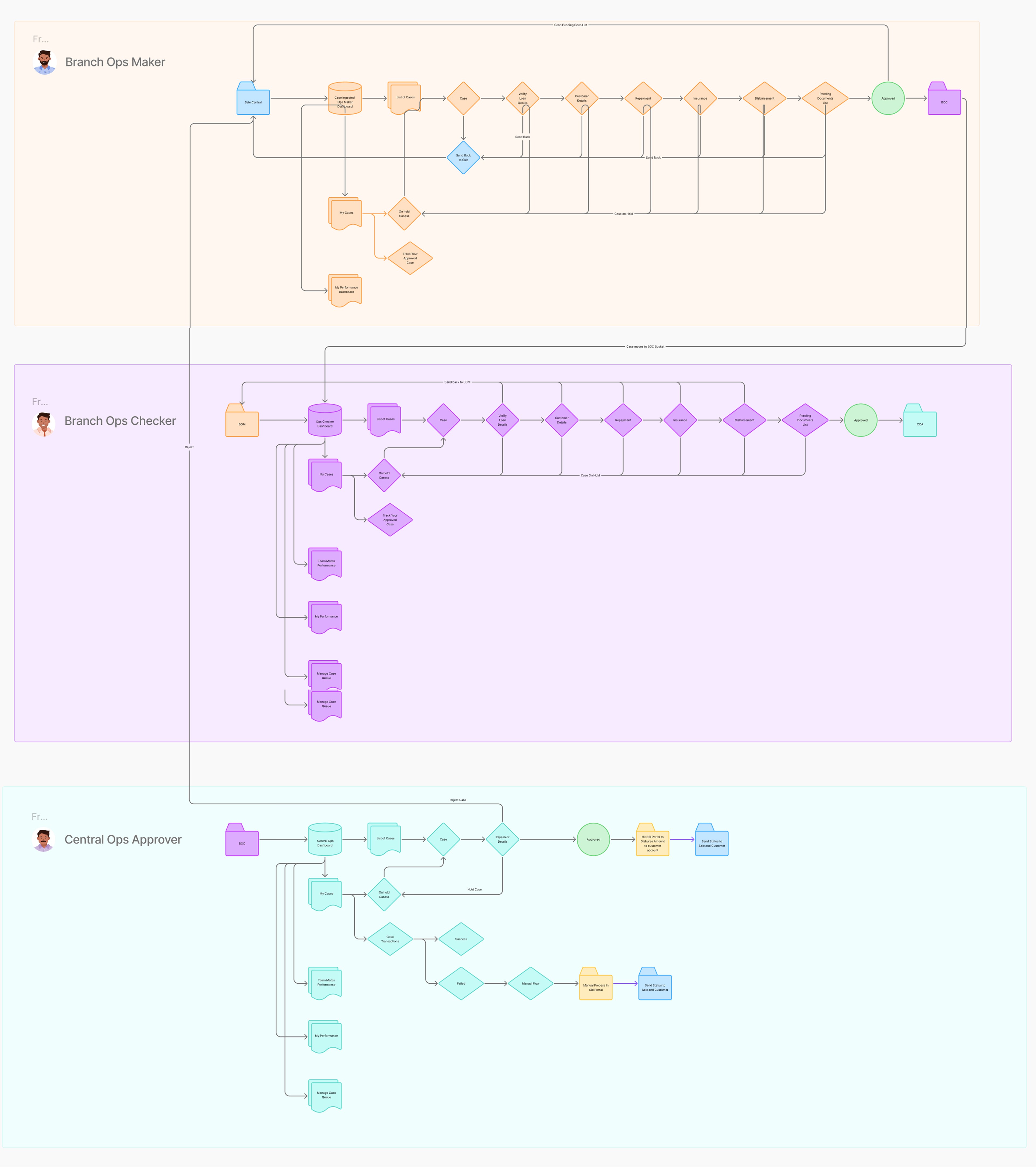
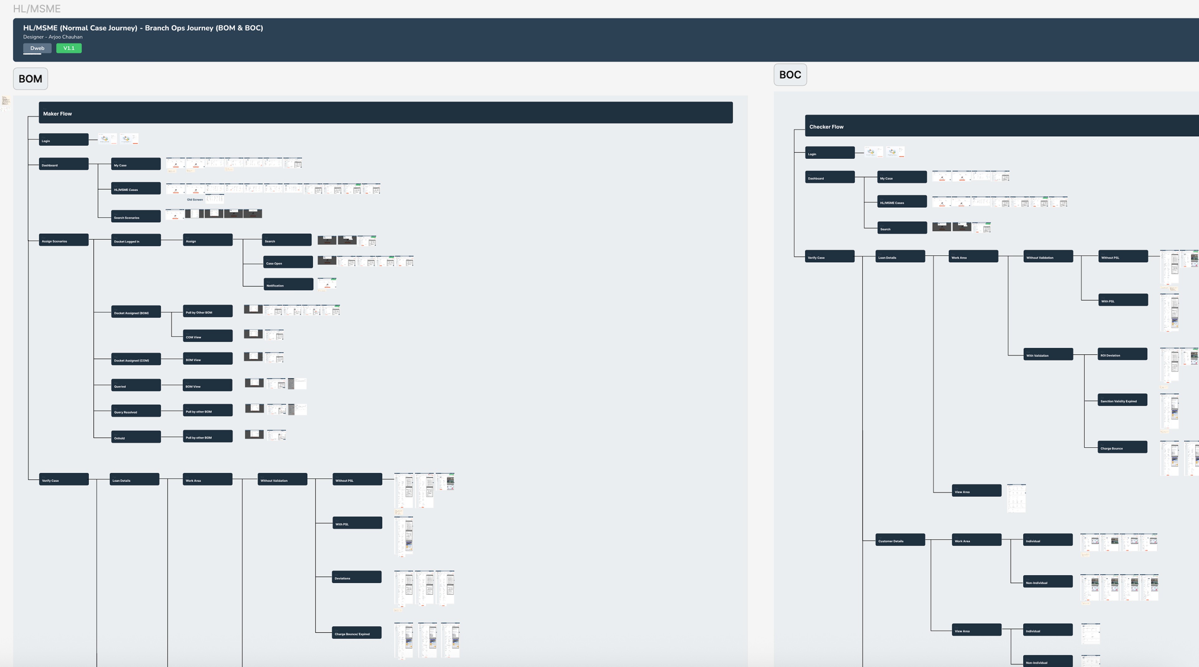
User Flow Architecture
User Flow Architecture
User Flow Architecture
Based on the research insights and key problem areas, I designed a structured loan verification flow that clearly defined actor interactions, responsibilities, and the essential features required at each stage to ensure a smooth and efficient process.
Based on the research insights and key problem areas, I designed a structured loan verification flow that clearly defined actor interactions, responsibilities, and the essential features required at each stage to ensure a smooth and efficient process.
Visual Design
Visual Design
Visual Design
After multiple rounds of wireframing and iterations, I finalized the visual design, ensuring clarity, consistency, and alignment with the structured verification flow.
After multiple rounds of wireframing and iterations, I finalized the visual design, ensuring clarity, consistency, and alignment with the structured verification flow.
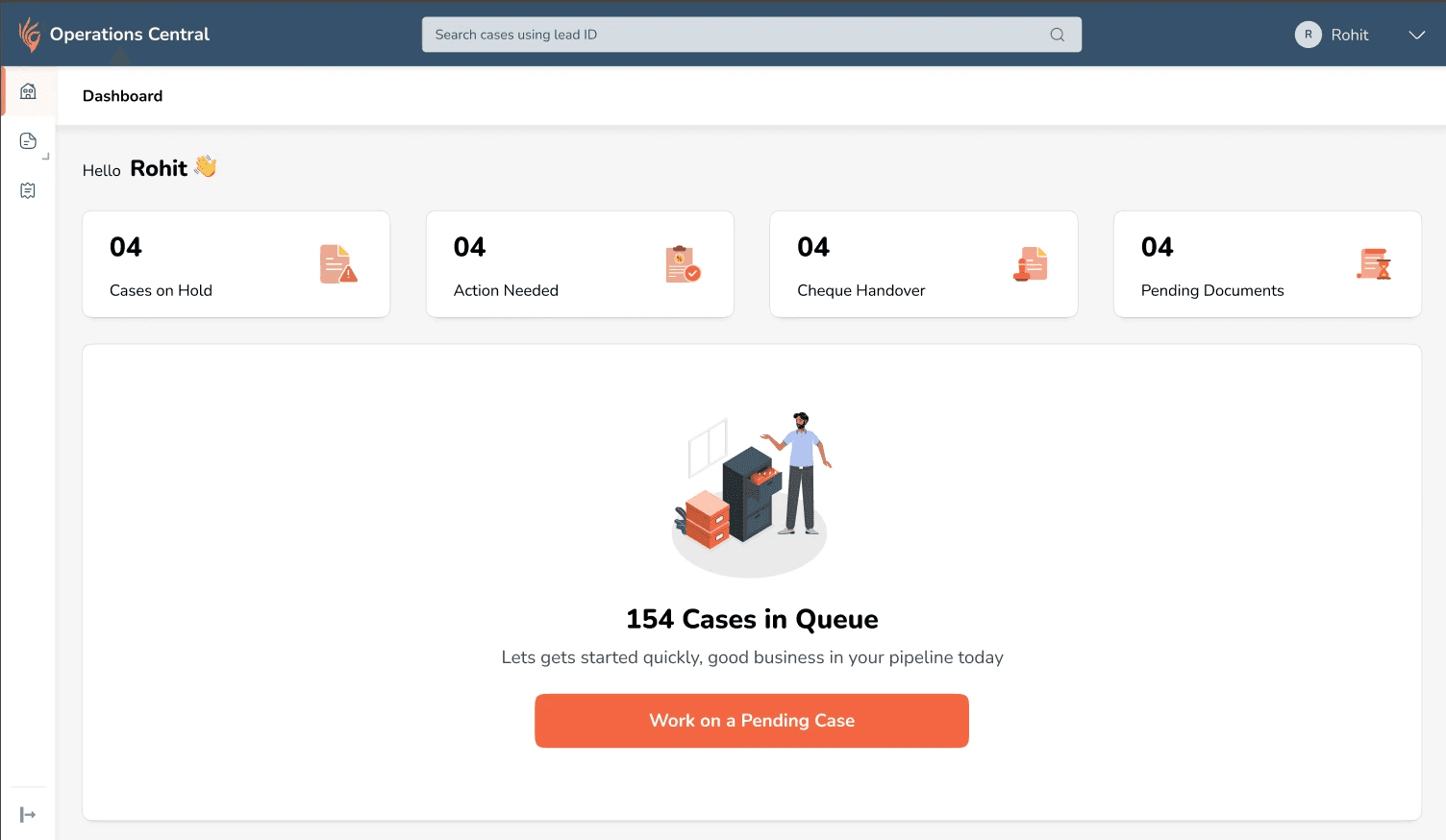
A. I introduced a Role-Based Dashboard designed to prioritise daily actions and reduce decision friction.
A. I introduced a dedicated "Work Area" to prioritise decision-critical fields within a focused verification environment.
The dashboard is role-based, showing only relevant actions. A primary CTA directs users to the prioritised queue, while action cards and urgency badges highlight secondary tasks and prevent backlog.
The dashboard is role-based, showing only relevant actions. A primary CTA directs users to the prioritised queue, while action cards and urgency badges highlight secondary tasks and prevent backlog.
B. I introduced a dedicated Work Area to prioritise decision-critical fields within a focused verification environment.
A. I introduced a dedicated "Work Area" to prioritise decision-critical fields within a focused verification environment.
The dedicated Work Area allowed users to focus only on fields requiring validation, with supporting documents displayed alongside for seamless review. Contextual hints, visual cues, and error messages improved clarity, while a step-based structure guided the process without restricting flexibility. Calculation-driven validations were automated to reduce manual effort and errors.
The dedicated Work Area allowed users to focus only on fields requiring validation, with supporting documents displayed alongside for seamless review. Contextual hints, visual cues, and error messages improved clarity, while a step-based structure guided the process without restricting flexibility. Calculation-driven validations were automated to reduce manual effort and errors.
C. Less critical information was intentionally placed within their respective category tabs to maintain clarity and reduce cognitive overload.
C. Less critical information was intentionally placed within their respective category tabs to maintain clarity and reduce cognitive overload.
No information was hidden from users, ensuring full visibility while preserving verification focus.
No information was hidden from users, ensuring full visibility while preserving verification focus.
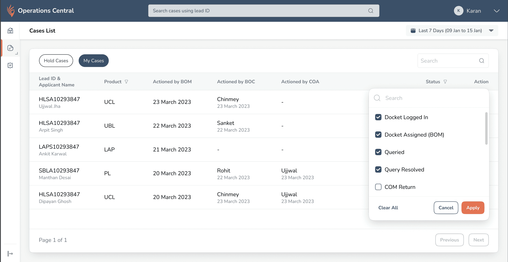
D. Introduced a Case History section to improve case visibility and ownership tracking.
D. Introduced a Case History section to improve case visibility and ownership tracking.
Users lacked visibility into case progress after completing their part and relied on memory to track status. I introduced a structured Case History view that shows the current state of each case, highlights where it’s stuck and with whom, and allows users to resume hold cases, improving transparency and continuity.
Users had no visibility into what happened to cases after completing their part. They couldn’t see where cases were stuck, identify returned or hold cases easily, and often relied on memory or manual notes.
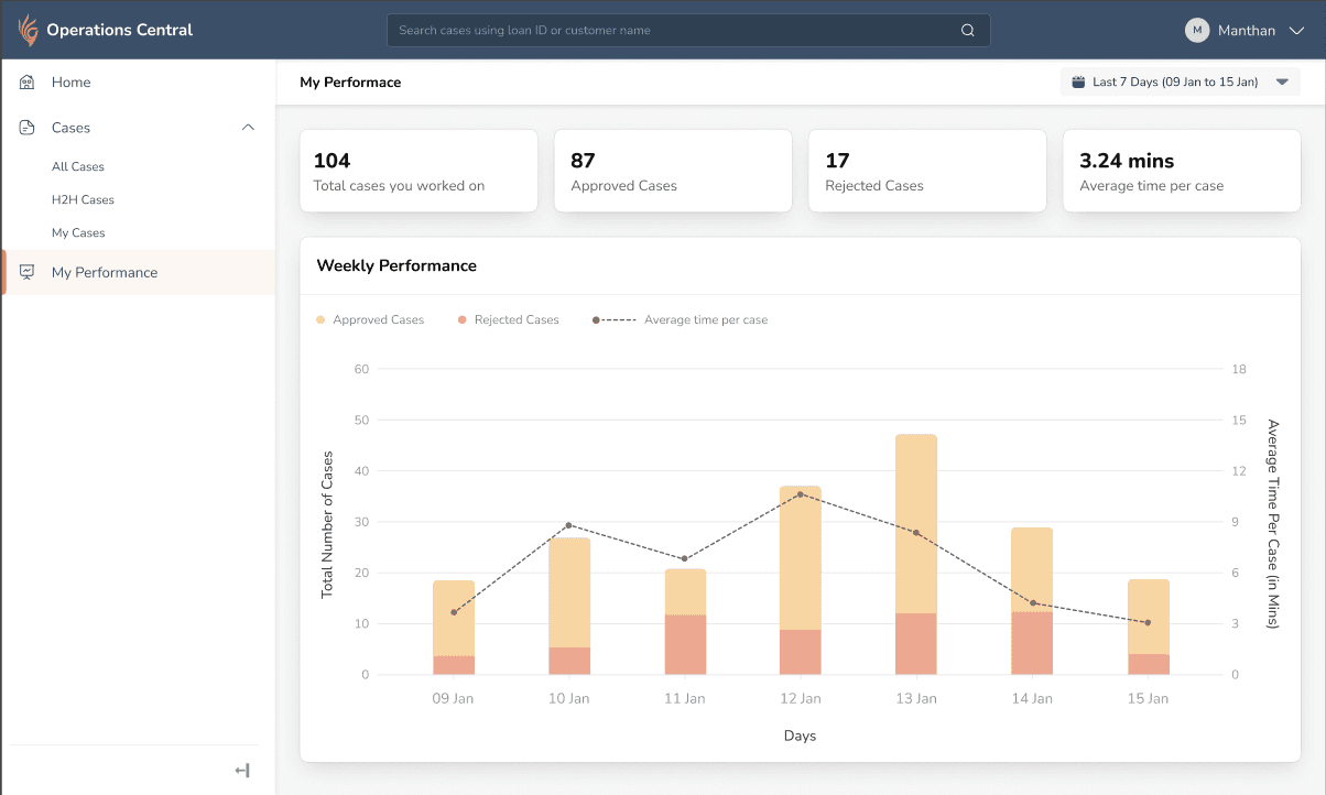
E. Introduced Performance Metrics to embed performance tracking within the workflow.
E. Introduced Performance Metrics to embed performance tracking within the workflow.
Users manually tracked performance metrics and lacked visibility into efficiency and approval trends. I introduced a performance dashboard showing case volume, average handling time, and approval ratios, embedding performance tracking within the workflow and aligning daily work with long-term goals.
Users were manually tracking performance metrics and lacked visibility into efficiency, approval trends, and time spent per case. Performance tracking existed outside the system, creating a disconnect between daily work and goals.
F. Introduced Queue Management to improve operational flexibility and prevent case stagnation..
F. Introduced Queue Management to improve operational flexibility and prevent case stagnation..
Cases were getting stuck when team members were unavailable, and high-priority items were buried in the queue, with no system-level control for redistribution. I introduced a Queue Management system that allows team leads to reorder priorities and reassign cases, improving workload balance and reducing SLA risk.
To prevent cases from getting stuck and high-priority items from being buried in the queue, I introduced a Queue Management system that allows team leads to reorder priorities and reassign cases, ensuring better workload balance and reducing operational delays.
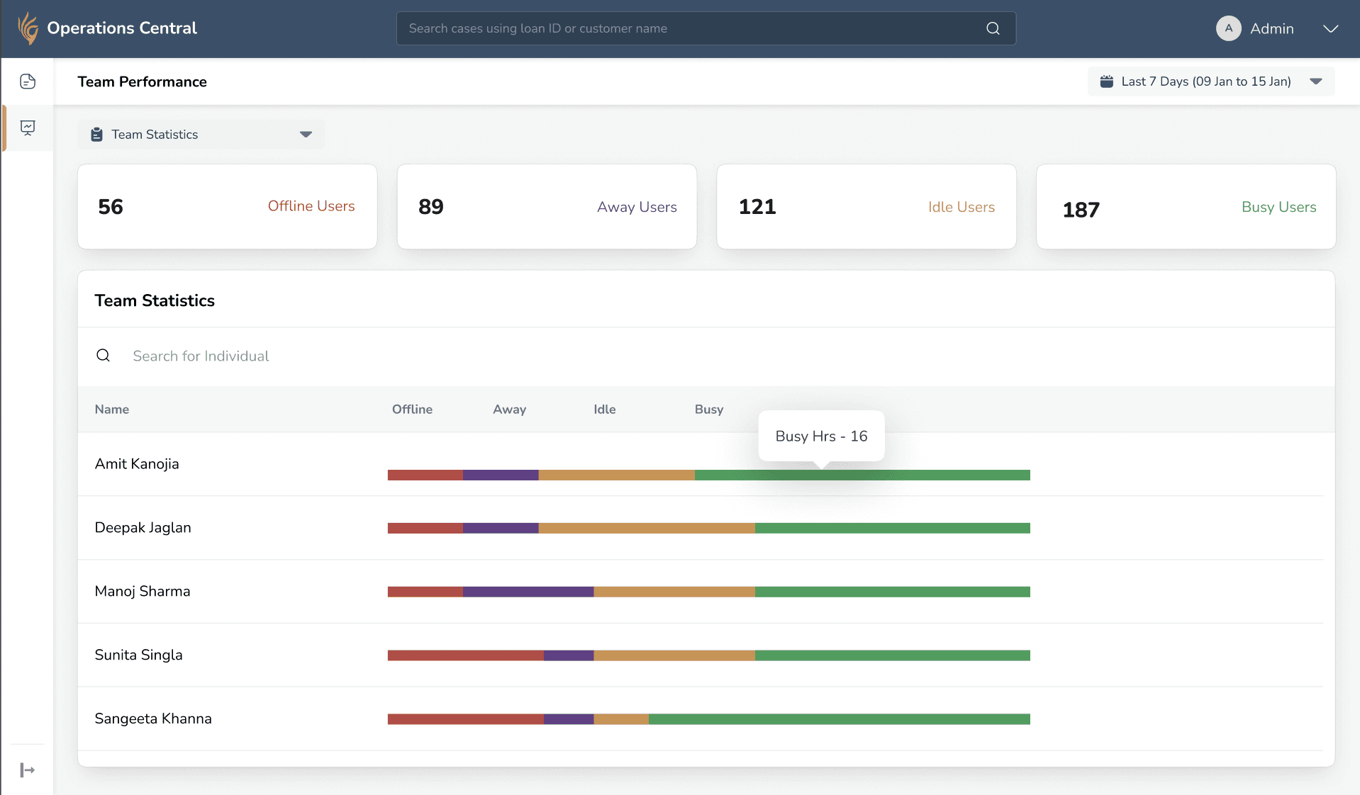
G. Introduced Team Performance Metrics to enable proactive supervision and workload visibility.
G. Introduced Team Performance Metrics to enable proactive supervision and workload visibility.
Team leads lacked real-time visibility into workload and often discovered bottlenecks too late. I introduced a Team Performance Dashboard showing member status and case distribution, enabling proactive supervision and early intervention.
To address the lack of real-time visibility into team workload and prevent delayed bottleneck detection, I introduced a Team Performance Dashboard that displays member status (Busy, Idle, Offline, Away) along with case distribution metrics such as assigned, in-progress, hold, and completed cases, enabling proactive supervision and early intervention.
Designing for Scalability
Designing for Scalability
Extended the flow Across different Product Variations
Extended the flow Across different Product Variations
Extended the flow Across different Product Variations
Building on the previously defined workflows, I reused the verification framework. The structure remained consistent while the logic adapted based on product-specific rules.
Building on the previously defined workflows, I reused the verification framework. The structure remained consistent while the logic adapted based on product-specific rules.
This exercise established a clear foundation for structuring the verification experience.
This exercise established a clear foundation for structuring the verification experience.
Outcome
Outcome
Outcome
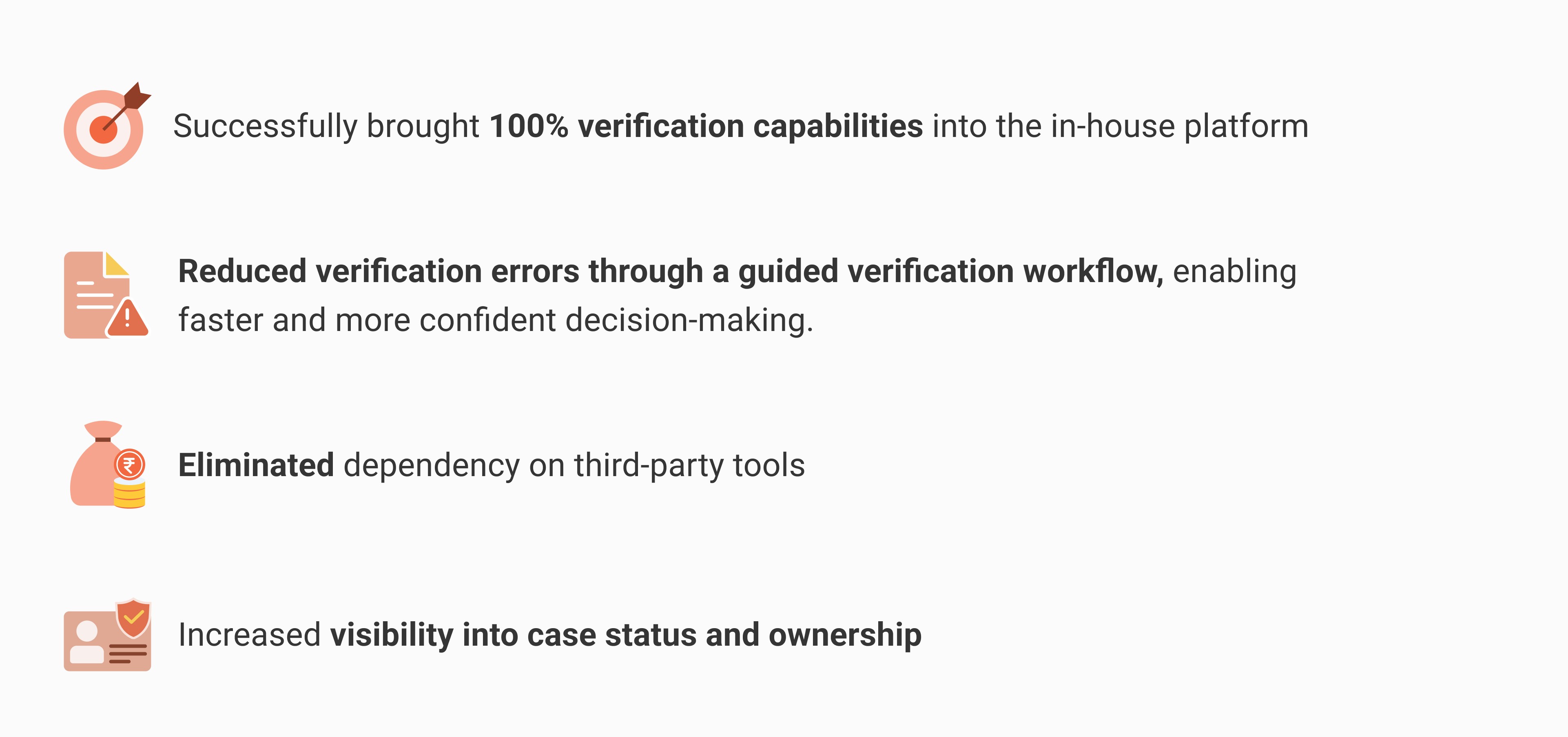
Success Story
Success Story
Success Story
Within one month of launch, the platform supported ₹2,800 Cr disbursements, accelerating the business toward a 20× growth milestone.
Within one month of launch, the platform supported ₹2,800 Cr disbursements, accelerating the business toward a 20× growth milestone.