
Revamping the End-to-End Flight Booking Experience
Revamping the End-to-End Flight Booking Experience
Revamping the End-to-End Flight Booking Experience
Escape is an inspiration-led flight search platform that helps users explore destinations, compare fares across 300+ airlines and 150+ travel agents, and track price drops, seasonal deals, and travel restrictions.
Escape is an inspiration-led flight search platform that helps users explore destinations, compare fares across 300+ airlines and 150+ travel agents, and track price drops, seasonal deals, and travel restrictions.
Despite offering rich data and competitive pricing, the platform struggled with high bounce rates and low engagement, especially during early exploration.
Despite offering rich data and competitive pricing, the platform struggled with high bounce rates and low engagement, especially during early exploration.
This project focused on redesigning the end-to-end flight booking experience to reduce decision friction. Helping users move smoothly from discovery to comparison to booking without unnecessary hesitation.
This project focused on redesigning the end-to-end flight booking experience to reduce decision friction. Helping users move smoothly from discovery to comparison to booking without unnecessary hesitation.
The Current Landscape
The Current Landscape
The Current Landscape
Travel planning is no longer linear.
Travel planning is no longer linear.
Users explore destinations without fixed plans, compare prices across platforms, and expect instant clarity before committing.
Users explore destinations without fixed plans, compare prices across platforms, and expect instant clarity before committing.
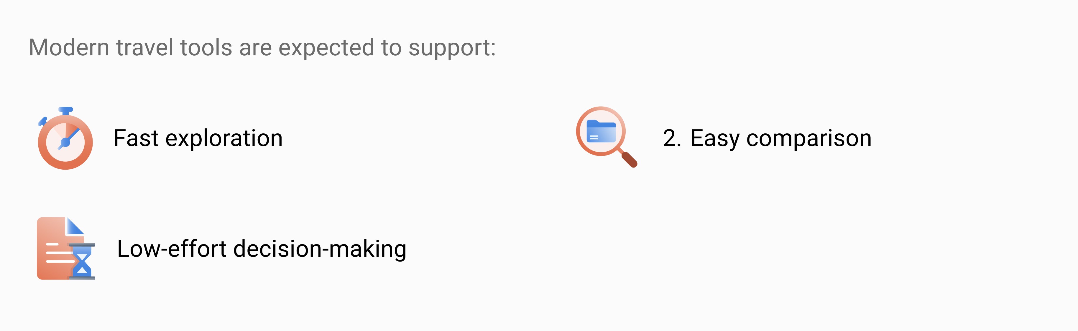
However, many platforms still overwhelm users with information upfront, forcing them to think too much, too early.
However, many platforms still overwhelm users with information upfront, forcing them to think too much, too early.
At Escape, this gap between information availability and decision support was causing users to drop off before they could meaningfully engage.
At Escape, this gap between information availability and decision support was causing users to drop off before they could meaningfully engage.

Core Problem: High Decision Friction
Core Problem: High Decision Friction
Core Problem: High Decision Friction
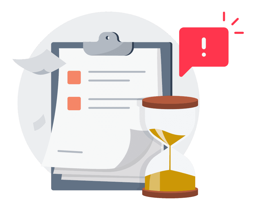
Users were leaving because the experience required too much effort to move forward.
Users were leaving because the experience required too much effort to move forward.
Users were leaving because the experience required too much effort to move forward.
Instead of feeling helped by the system, users were being asked to think like system designers.
Instead of feeling helped by the system, users were being asked to think like system designers.
Who this was for?
Who this was for?
Who this was for?
The experience was designed for people casually browsing travel ideas, comparing destinations, and planning trips without fixed dates or destinations.
The experience was designed for people casually browsing travel ideas, comparing destinations, and planning trips without fixed dates or destinations.

Design Approach
Design Approach
Design Approach
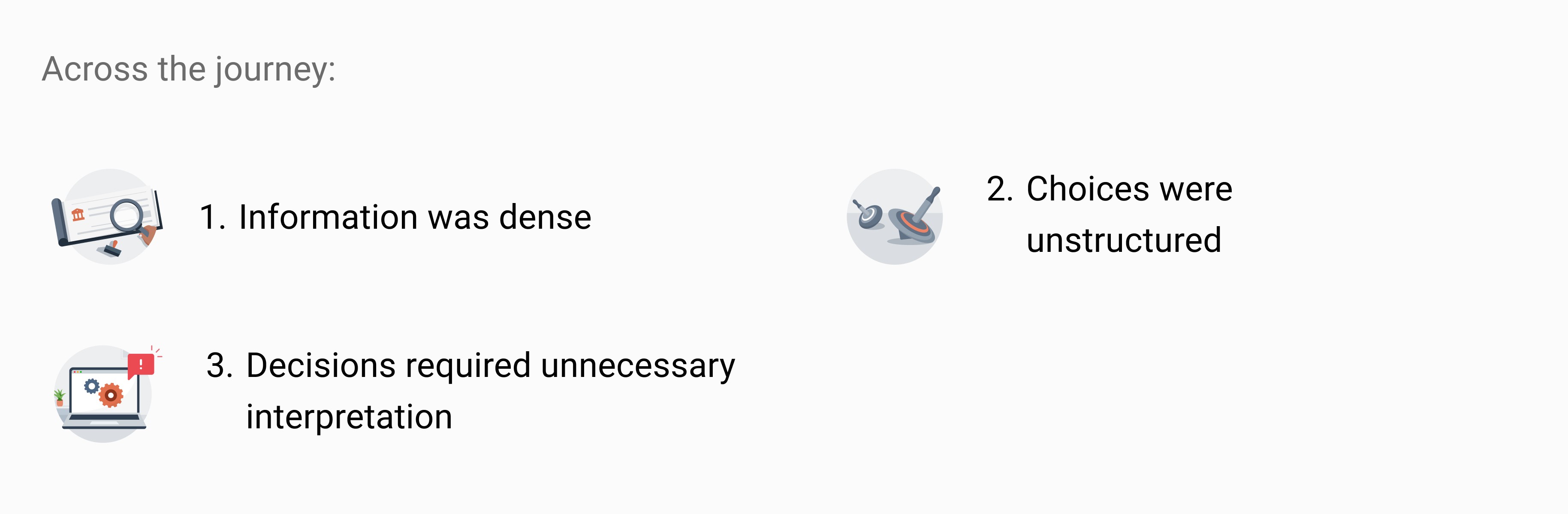
Instead of redesigning individual screens in isolation, I looked at the entire booking journey to understand where users slowed down or dropped off.
Instead of redesigning individual screens in isolation, I looked at the entire booking journey to understand where users slowed down or dropped off.
The focus was on identifying moments where users had to stop, think, or compare too much and simplifying those interactions so the journey felt easier and more continuous.
The focus was on identifying moments where users had to stop, think, or compare too much and simplifying those interactions so the journey felt easier and more continuous.
Heuristic Evaluation Findings
Heuristic Evaluation Findings
Heuristic Evaluation Findings
The Landing Page Didn’t Create Direction
The Landing Page Didn’t Create Direction
The Landing Page Didn’t Create Direction
The landing page presented a lot of information but lacked a clear narrative.
The landing page presented a lot of information but lacked a clear narrative.
Users struggled to understand:
Why Escape was different
Where to begin
What action to take next
Users struggled to understand:
Why Escape was different
Where to begin
What action to take next
Without a clear starting point, exploration stalled early.
Without a clear starting point, exploration stalled early.
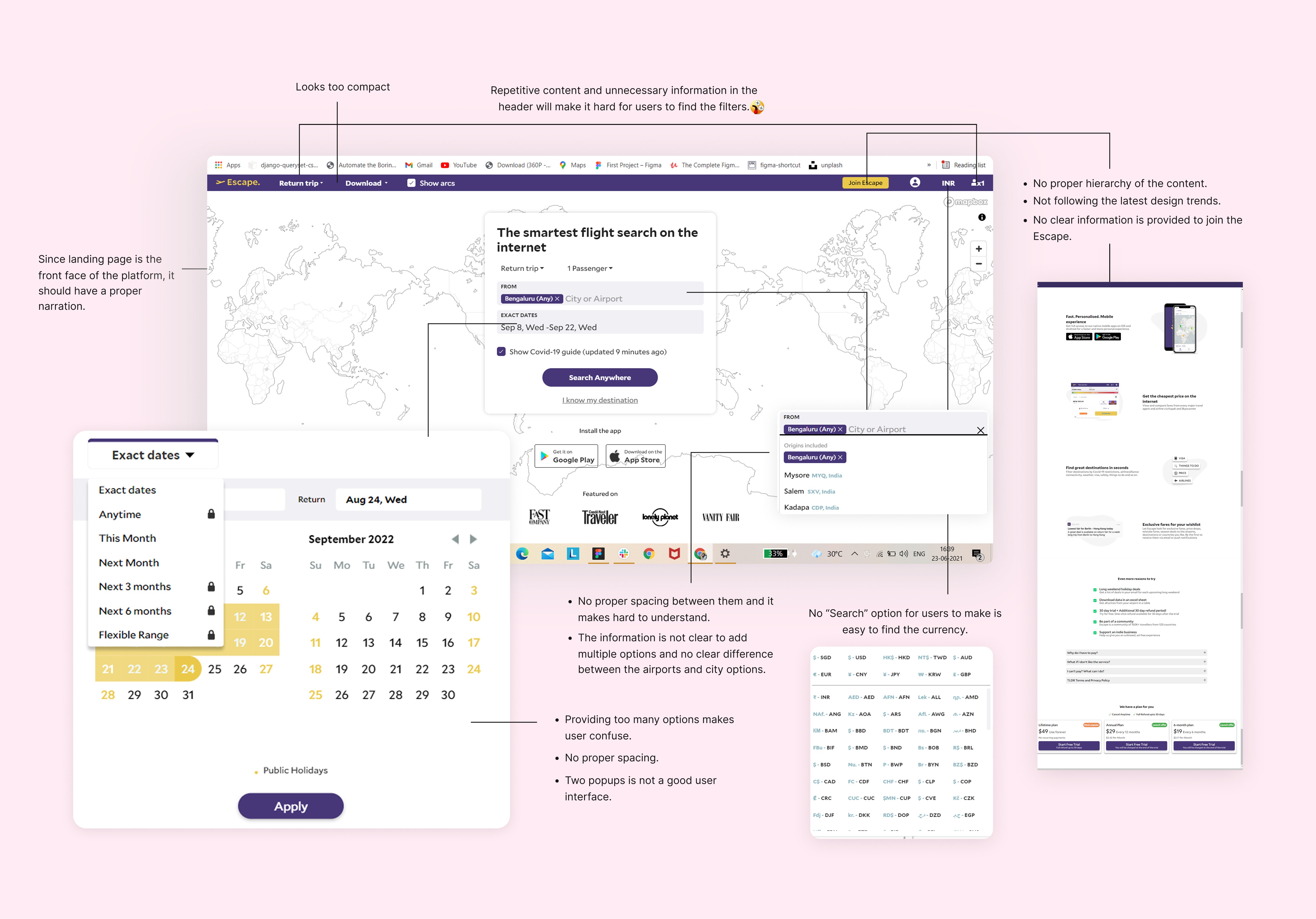
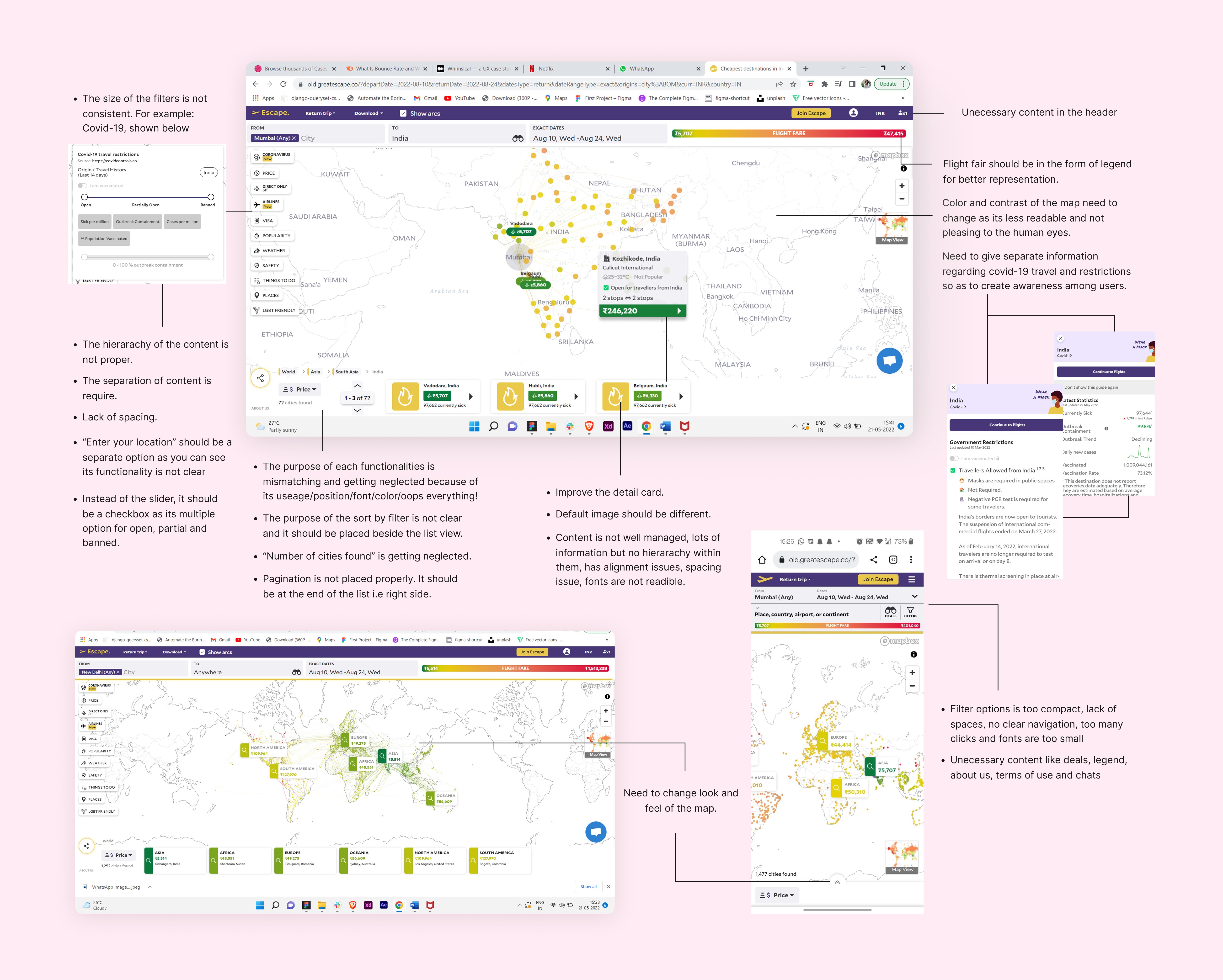
Exploration Required Too Much Effort
Exploration Required Too Much Effort
Exploration Required Too Much Effort
The map-based interface had strong potential for inspiration, but usability issues increased effort:
Filters were compact and overwhelming
Irrelevant information competed for attention
COVID-19 restrictions were mixed into the booking flow
Each interaction required adjustment, slowing down exploration.
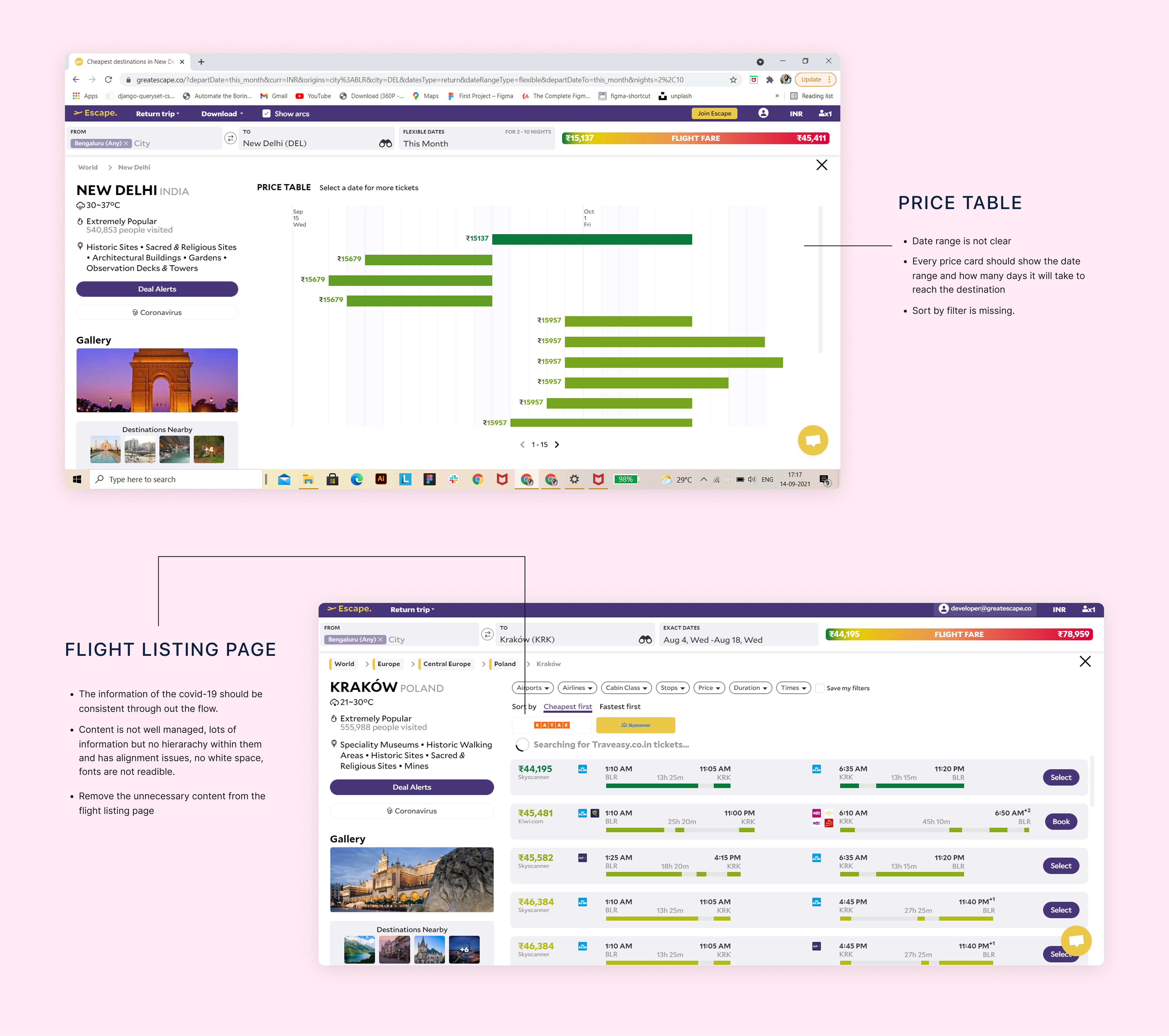
Comparison Didn’t Support Fast Decisions
Comparison Didn’t Support Fast Decisions
Comparison Didn’t Support Fast Decisions
When users reached flight listings:
Information density was high
Key differences weren’t immediately visible
Comparing options required excessive scanning
Users were ready to decide — but the interface didn’t help them do so efficiently.
When users reached flight listings:
Information density was high
Key differences weren’t immediately visible
Comparing options required excessive scanning
Users were ready to decide — but the interface didn’t help them do so efficiently.
Creating a Design Foundations
Creating a Design Foundations
Creating a Design Foundations
Information Architecture
Information Architecture
Information Architecture
Information Architecture defines how content should be structured and present to a user when they are interacting with the design.
Information Architecture defines how content should be structured and present to a user when they are interacting with the design.
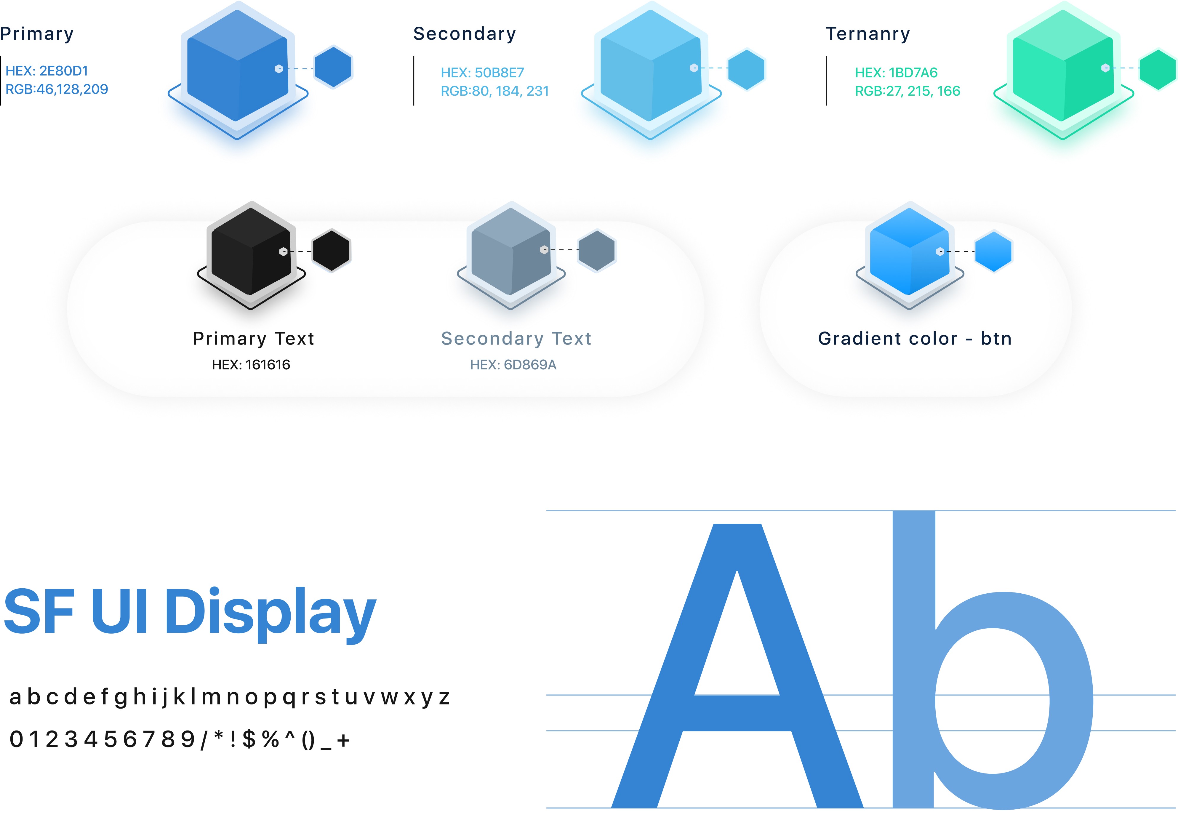
Visual Language
Visual Language
Visual Language
Typography and colour choices were refined to improve readability, establish visual rhythm, and reduce fatigue during long planning sessions.
Typography and colour choices were refined to improve readability, establish visual rhythm, and reduce fatigue during long planning sessions.
Illustrations
Illustrations
Illustrations
Friendly, contextual illustrations were introduced to add warmth, reduce perceived effort, and keep the experience approachable.
Friendly, contextual illustrations were introduced to add warmth, reduce perceived effort, and keep the experience approachable.
Design System
Design System
Design System
I created a reusable component library and visual design system to ensure consistency, scalability, and faster iteration across the product.
I created a reusable component library and visual design system to ensure consistency, scalability, and faster iteration across the product.
Design Solutions
Design Solutions
Design Solutions
Improving Entry and Navigation
Improving Entry and Navigation
Improving Entry and Navigation
The landing page was restructured to:
Establish a clear hierarchy
Communicate Escape’s value early
Highlight deals, inspiration, and benefits upfront
Introduce trust signals and app adoption naturally
The goal was not to explain everything, but to give users a reason to continue exploring.
The landing page was restructured to:
Establish a clear hierarchy
Communicate Escape’s value early
Highlight deals, inspiration, and benefits upfront
Introduce trust signals and app adoption naturally
The goal was not to explain everything, but to give users a reason to continue exploring.
The landing page was restructured to:
Establish a clear hierarchy
Communicate Escape’s value early
Highlight deals, inspiration, and benefits upfront
Introduce trust signals and app adoption naturally
The goal was not to explain everything, but to give users a reason to continue exploring.
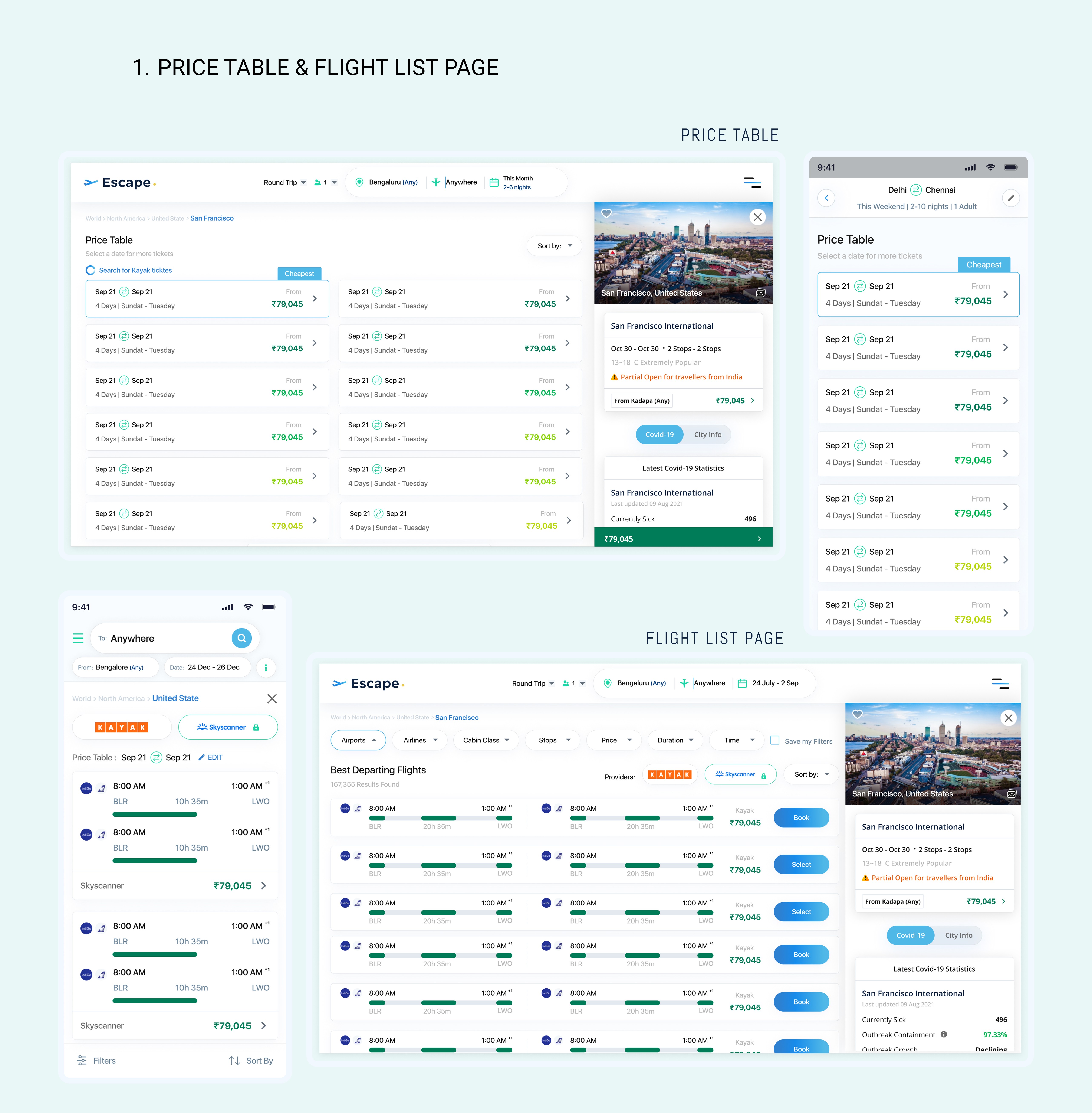
Simplifying Exploration
Simplifying Exploration
Simplifying Exploration
The map-based exploration experience was refined to reduce effort while browsing destinations.
The map-based exploration experience was refined to reduce effort while browsing destinations.
Changes included:
Cleaning up visual clutter
Showing filters based on the selected itinerary
Separating travel restriction information into a dedicated section
Improving map clarity and interactions
This made exploration faster and easier without removing useful information.
Changes included:
Cleaning up visual clutter
Showing filters based on the selected itinerary
Separating travel restriction information into a dedicated section
Improving map clarity and interactions
This made exploration faster and easier without removing useful information.
Improving Decision Support in Listings
Improving Decision Support in Listings
Improving Decision Support in Listings
The flight listing and price comparison views were updated to help users evaluate options more quickly.
The flight listing and price comparison views were updated to help users evaluate options more quickly.
Key changes:
Improved scanability of listings
Clearer emphasis on important differences
Reduced need to switch back and forth between options
The goal was to help users compare confidently without feeling overwhelmed.
Key changes:
Improved scanability of listings
Clearer emphasis on important differences
Reduced need to switch back and forth between options
The goal was to help users compare confidently without feeling overwhelmed.
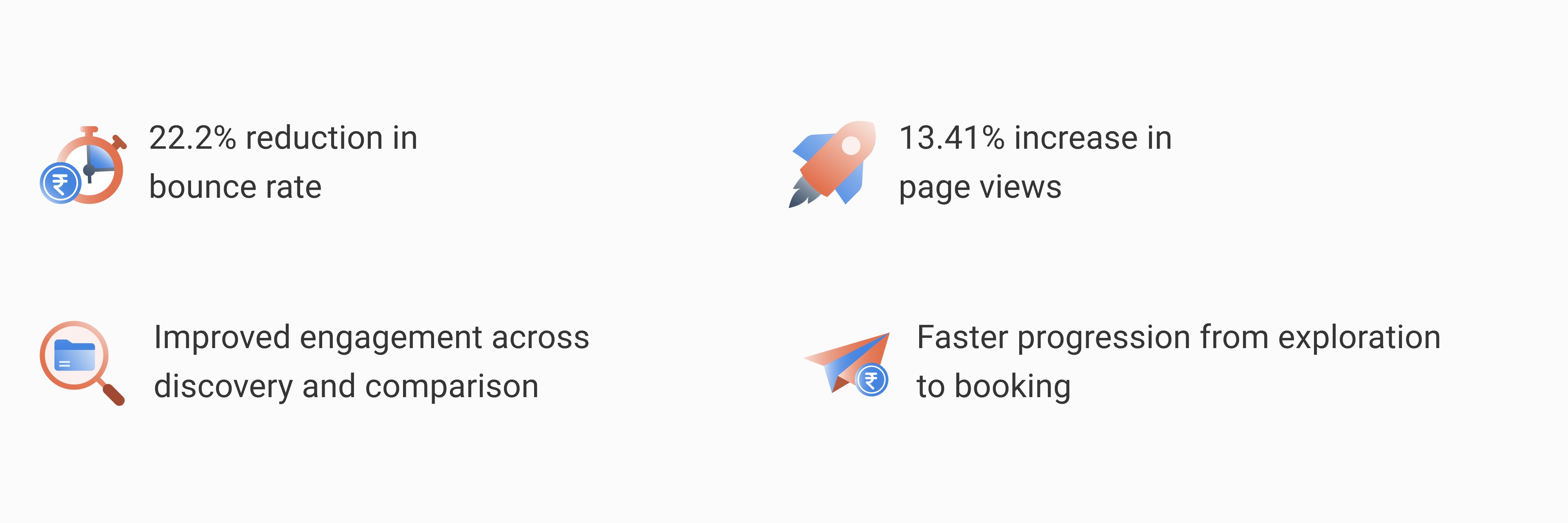
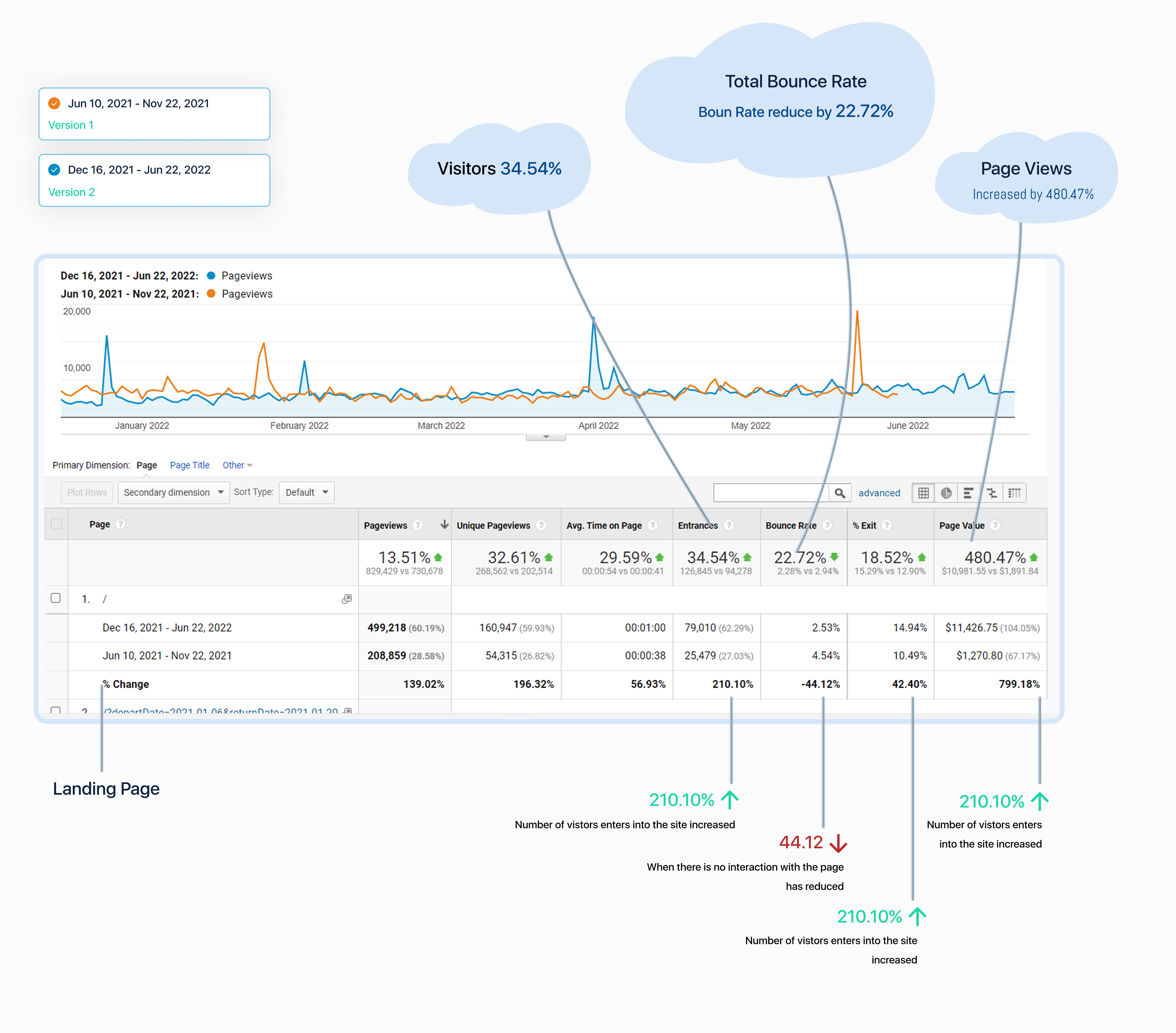
Impact
Impact
Impact
The redesigned experience delivered measurable improvements:
The redesigned experience delivered measurable improvements:
Key Takeaway
Key Takeaway
Key Takeaway
Good user experience isn’t always about adding more. Many times, it comes down to simplifying what’s already there, removing extra effort, and helping users progress smoothly.
Good user experience isn’t always about adding more. Many times, it comes down to simplifying what’s already there, removing extra effort, and helping users progress smoothly.
